Popular Color Schemes for Summer

We wait all year for summer to arrive and when it does it’s almost necessary to take complete advantage of it. And there’s no better way to do that than with a complete upgrade in your summer color palette! Create a high-style and refreshing look this summer with soft browns, deep greens, and delightful pinks. Whether you prefer warmer tones in your palette for those cozy summer nights or cooler tones for a refreshing new look, we’ve got it all. Take a look at these top color schemes for summer!
Warm Tones
Warm tones are for those who love roasting marshmallows and binging old summer movies. These colors include shades of brown, orange, and red to help create a “warming effect” in your home and are usually stronger, darker, and/or bolder in nature.
Tawny
Traits:
- Stability
- Peace
- Organic
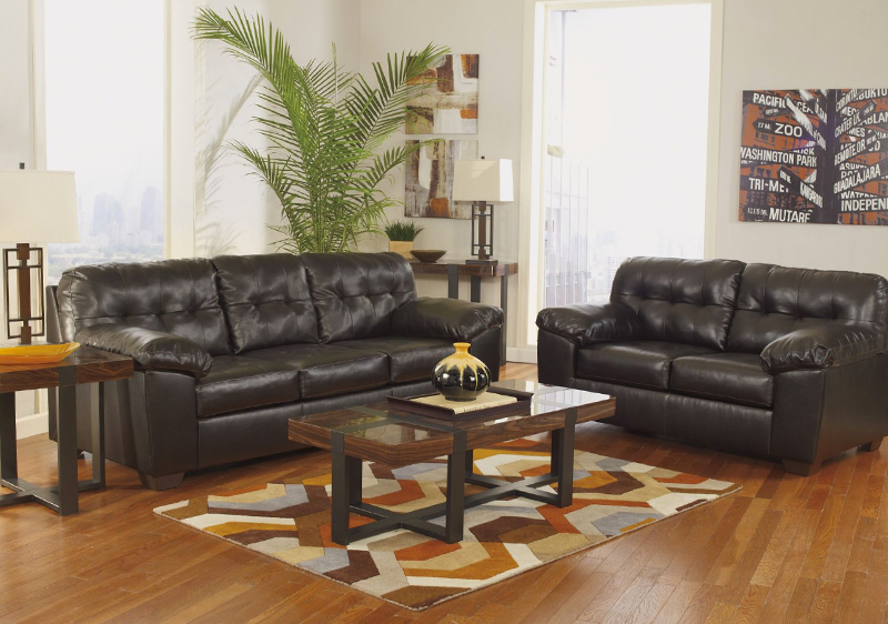
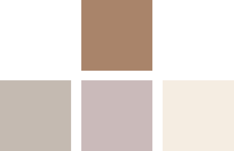
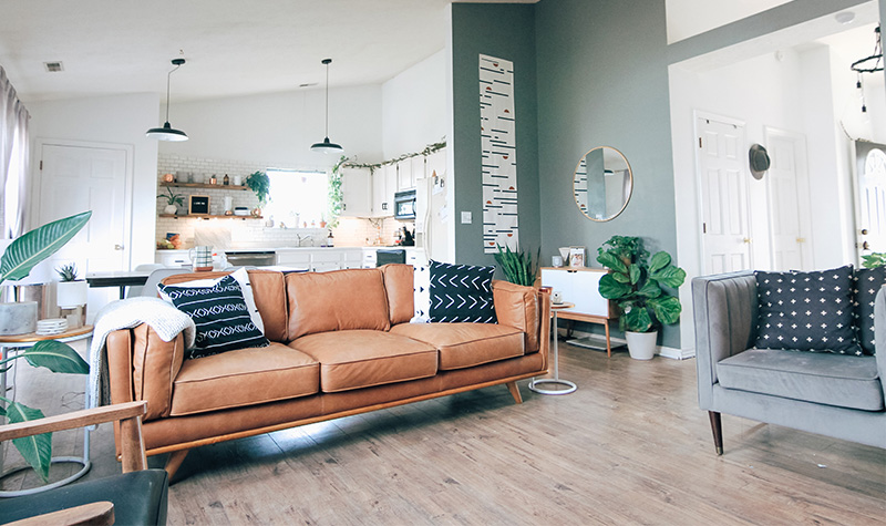
Utilizing brown in your home can quickly become a key component to your summer color palette. Tawny is a blend of brown and tan that offers a softer take on a chromatic neutral look. It closely resembles to wood and brings out that sense of nature we crave during summer. You can use this hue throughout your home with leather furniture, wooden accessories, or wall paint for a regal, aged look. Include tawny to your color scheme for summer for beautiful interior styling.
*Pairs great with are grays, pinks, and creams for a soft earthy aesthetic.
Flame

Traits:
- Playful
- Joy
- Fun
Who doesn’t love a pop of color in their home? Flame Orange is named after the literal color of fire. With red and yellow undertones, this shade helps symbolizes energy and youth and is perfect for your color schemes for summer. However, flame orange can make or break your entire palette so it’s important to know your limit! Even the slightest touch of orange will brighten your space so consider minimal decor ideas like orange throws, or flowers. Nevertheless, it’s always exciting to try something new! Be bold with your color choice and flaunt your flame orange décor!!
*Pairs perfectly with greens, blues, and tan for a killer interior.
Olive

Traits:
- Growth
- Harmony
- Balance
Any hint of green makes us happy. It introduces harmony and peace into your home with the slightest touch. Olive green is a deeper, more mellow shade of green that, when used correctly, can create a relaxing ambiance. You can use green in your home with furniture or accessories but most importantly… with plants! Flowers and plants are a great way to complement summer, not only do they have a natural beauty but delightful fragrance!
*Pair this color with brown and gray to bring balance to your space.
Cool Tones
Cooler tones set the scene for summer. They define a classy look to your interior with their soothing shades and subtle undertones. Certain hues of blues, pinks, and yellows can be used to brighten up a space to connect you with nature. These colors are perfect for those.
Pale Cerulean

Traits:
- Tranquility
- Intelligence
- Loyal
Pale Cerulean is another great addition to any summer color palette. The color blue can be associated with calmness and tranquility, which is perfect when designing a summer aesthetic. This shade of blue can be used in any format from furniture or décor to help increase a tranquil environment and promote a coastal-inspired style.
*Pair this color with brown, yellow, and gray for a refined look.
Cherry Blossom
Traits:
- Sweetness
- Femininity
- Charm
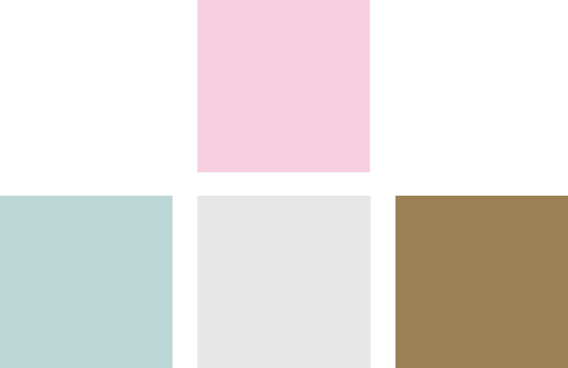
Pink is a no-brainer to include in a summer color palette. It’s a delicate yet passionate tone all in one. Cherry Blossom is a lighter and brighter shade of pink that when incorporated into your interior can create a tender, yet playful, aesthetic. Use gold décor, such as a flower vase, accent pillow, or painting to complement your pink walls, carpet, or furniture.
*Pairs nicely with gold, purple, green, and gray for a boho-inspired interior.
Daffodil

Traits:
- Happiness
- Creativity
- Enlightenment
Yellow can be considered both a warm or cool tone. Depending on the shade, yellow can be utilized in your summer color palette when paired with other cooler tones. Daffodil is a softer shade of yellow that’s a mix between yellow, gold, and orange. With being associated with sunshine, it seems wrong not to include it in your color palette. Similar to other colors, yellow is extra visually pleasing when it is used as décor. Consider daffodil as a soft addition to one of your color schemes for summer!
*Pair this color with green, purple, and blue for a touch of gracefulness.


Amish Outdoors Deluxe Yellow Adirondack Chair


Mixing Tones
Combining shades that are both warm and cool can be effective in creating your style. One great way to accomplish this is by choosing one warm tone and paring it with multiple cooler tones. Start with your basics, such as cream and blue, and then add your “accent color”. Brown is a universal color that can match anything, so take any shade of it you like and consider it your “accent color”. You can do this by painting just ONE wall that color or by furnishing your home with a brown couch or rug.
Try out these color schemes for summer in your home today!
Related Articles

Your Personality Based on When You Decorate for the Holidays
Updated: October 17, 2025

A Festive Tour of All Our Christmas Decor
A Festive Tour of All Our Christmas Decor

